
Gallery System for School of Design
Individual Project | Web + Visual Design
Gallery System for School of Design
Individual Project | Web + Visual Design
Quick Facts:
Role:
Information architect, visual designer
Time:
Fall, 2013 (2 weeks)
Client:
School of Design at CMU
(05-828: Advanced Web Design)
[Skills]
Methods:
Content strategy (IA), Sketching, wireframing, visual design
Tools:
Illustrator, Balsamiq, Paper53 on iPad
Deliverable:
Gallery system high-fidelity mockups
Quick Facts:
Please see previous slide

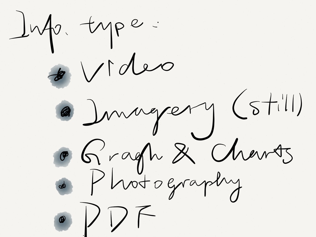
Project goal: To design a gallery system for the new CMU School of Design website. This gallery system needs to accommodate a variety of media in several different contexts and work on many platforms. As the targeted website is already existed, the design that created needs to be functionally effective within existing framework while being true to the current visual system. Types of media can be:
- Still imagery
- Video
- Graphs, charts, or other graphics
- Photography
- PDF downloads
Contents to consider:
1. Newly released School of Design website and its visual styles can be viewed here
2. The website has no good way currently to showcase media tied to the school. Some of the contents might include:
- Student work shown on a student page (photo, still image, or video)
- Student work shown on other pages (i.e., a course page, story page, faculty page)
- Faculty work shown on faculty pages (photo, still image, or video)
- Faculty work shown in other pages
- Photos or videos of happenings
- Photo or video from lectures
- Audio interviews or other audio files
My Solution


Check out real pixels in a PDF (6 pages)
Sketches and Design Process work
I first listed the contents that might be valuable to add to the school’s website, and then I listed four information item organizing structure, in order to have in mind what content can be used in what way to present effectively on the website. This helped me to map the attributes of media and its possible presentation capabilities.
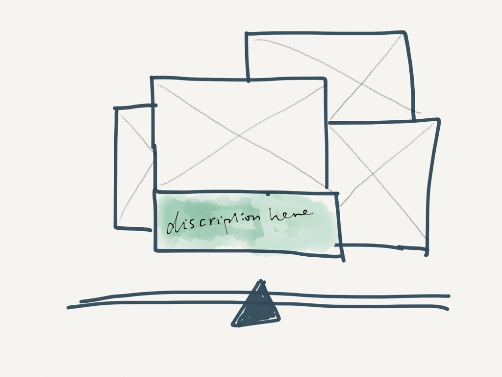
I then sketched a few ideas to display multiple media in a limited size of space, like a highlighter. The reason that I am thinking in this direction is to practice some of the mappings that I framed from the earlier process, and to see it from the perspective of its visual structure, the information complexity, and whether they are easy to be interpreted by whoever coming to the site and looking at them.

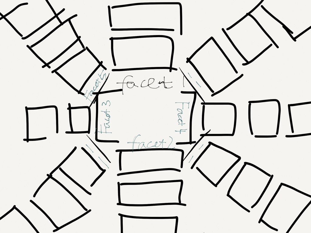
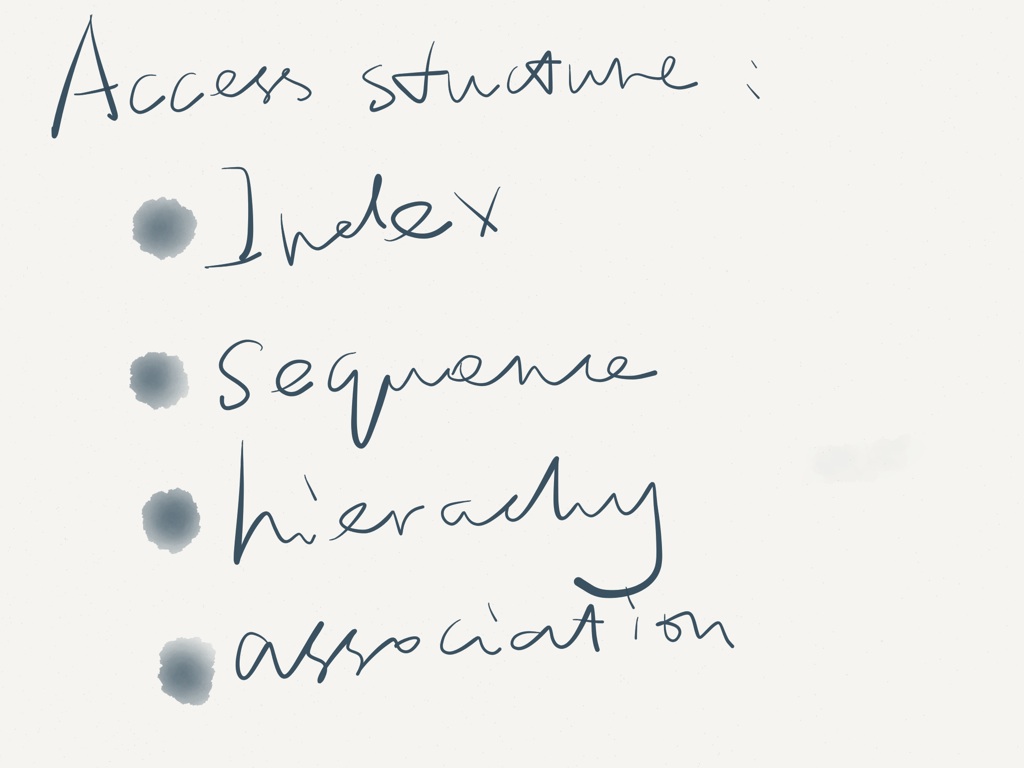
I also thought about having a stand-alone page to be a “landing page” for all multimedia on the school of design website, something like DOMAIN/gallery strikes me a lot at this point. So the system will be more flexible and salable in rendering a variety of different types of media files. Here is one of the approach I tried (including access structures like linear, hierarchical, and index, in order to accommodate different affordance of the media files!):
We did a couple of in-progress critique of our work in the class of Advanced Web Design (thanks to Prof. Twigg & the entire class!). After the inspiring critic, I had got chance to re-probing the problem in many more valuable ways that I did not foresee. For instance, the organizing pattern that I spent most of time investigating can be more varied, such as using tag filter, a word cloud, time-based displays, uses of modal screens, etc. I then realized that different media, audio, video, and pics should all be accounted for a branding image, and think big for perspective students who are coming to the site and see selected work from the School of Design.
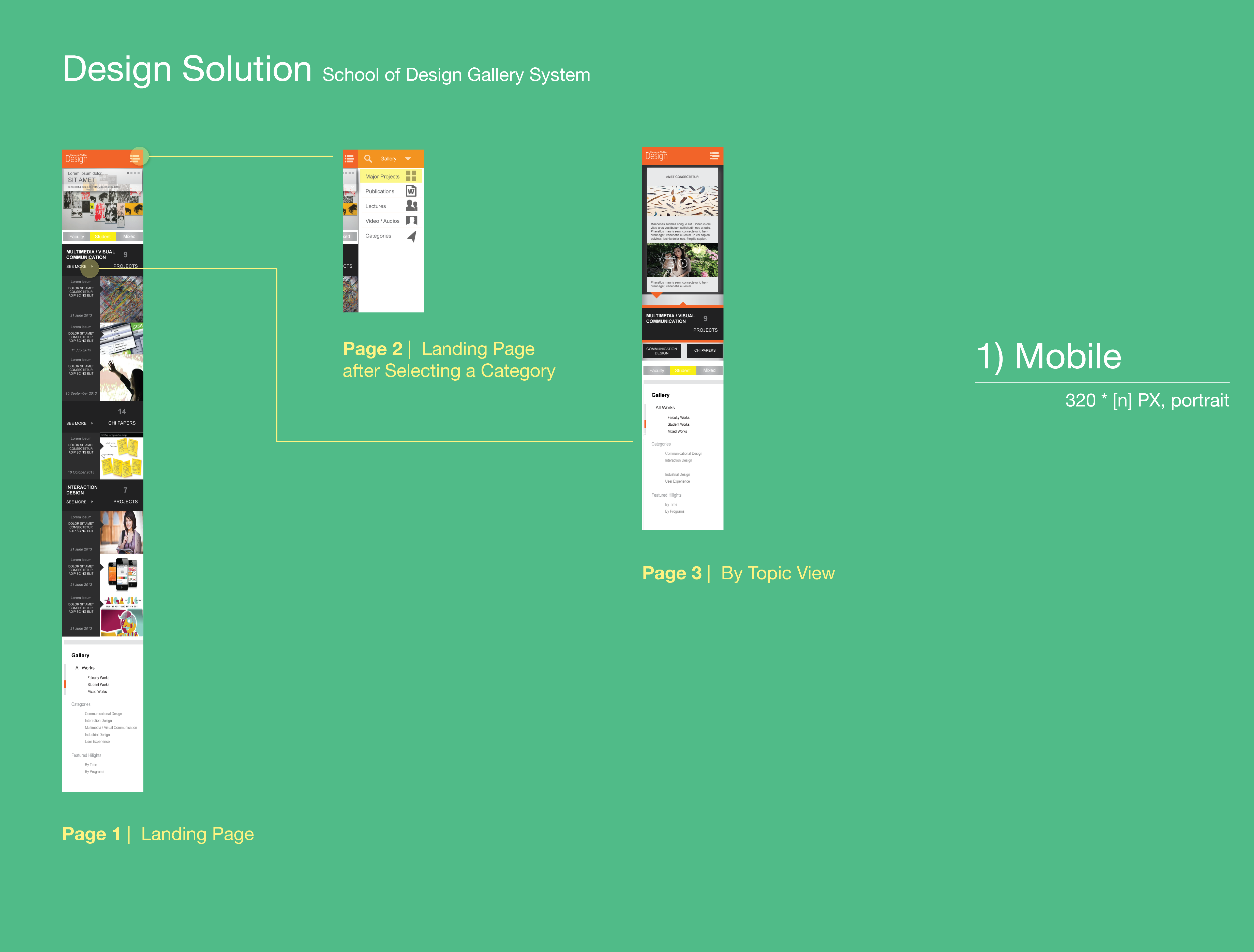
In this sense, I shifted a bit my focus from trying to reorganize the existing items to actively showcasing the work more effectively. Below are some of the evolving work that I started in mobile, aiming to find a clear and simple (often linear and to the point) navigation for the audience to browse my system.

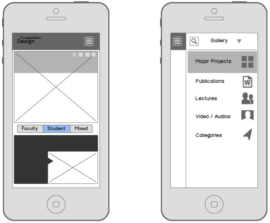
I decided to go with the 2nd version for its ease of identifying most important information to focus. 1st version creates more distraction using the grids on a phone. With a highlighted background and a call-out shape, it is natural to draw the visual attention into the content presented in the frame, with direct and simple category information on the top region that is ready for quick glancing. Based on the on-page light navigational pattern (tabs instead of all in one side menu), I also sketched what the tabs will be like in the desktop/tablet view, in correspondence with the mobile version.

Then I feel good to go far from this point!
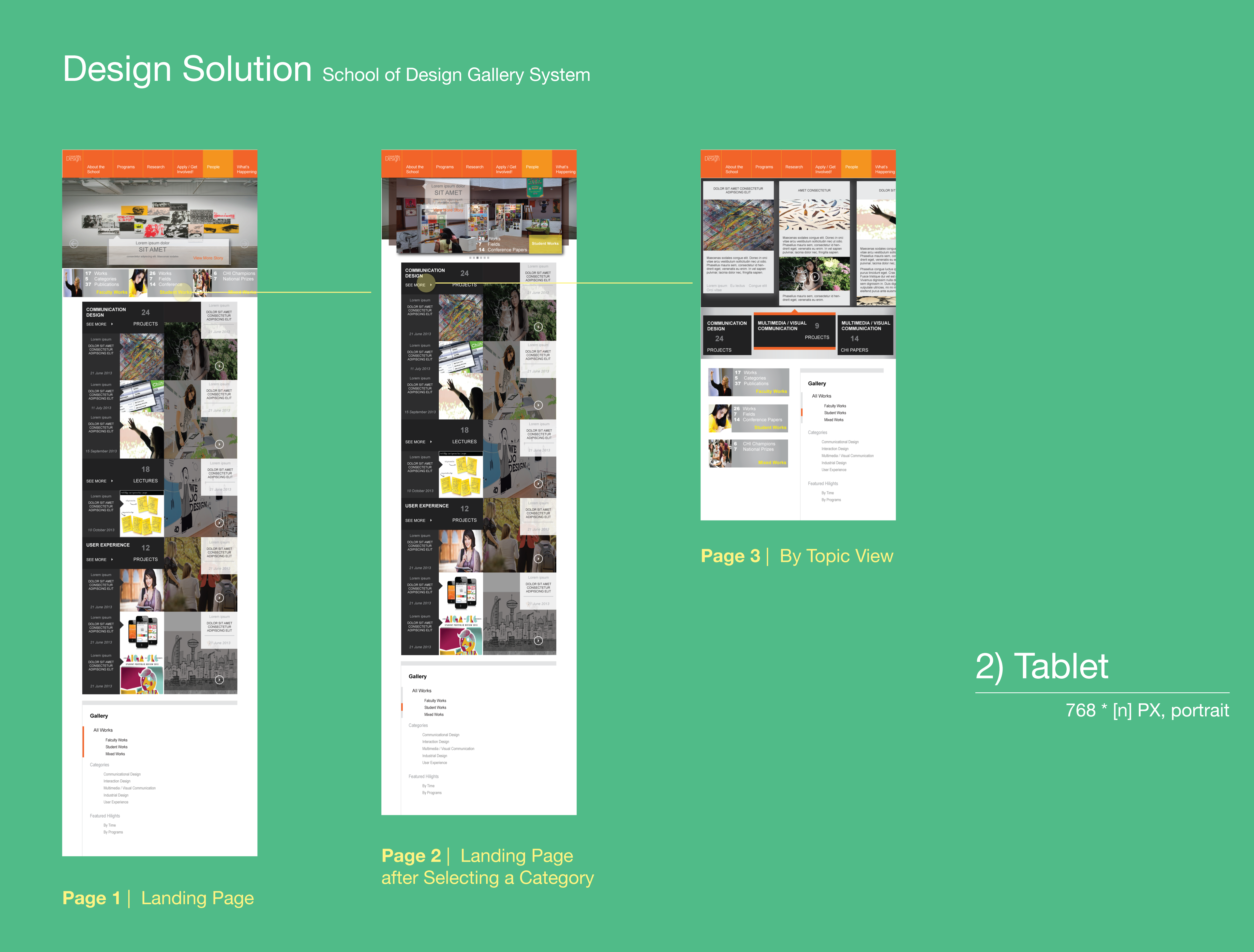
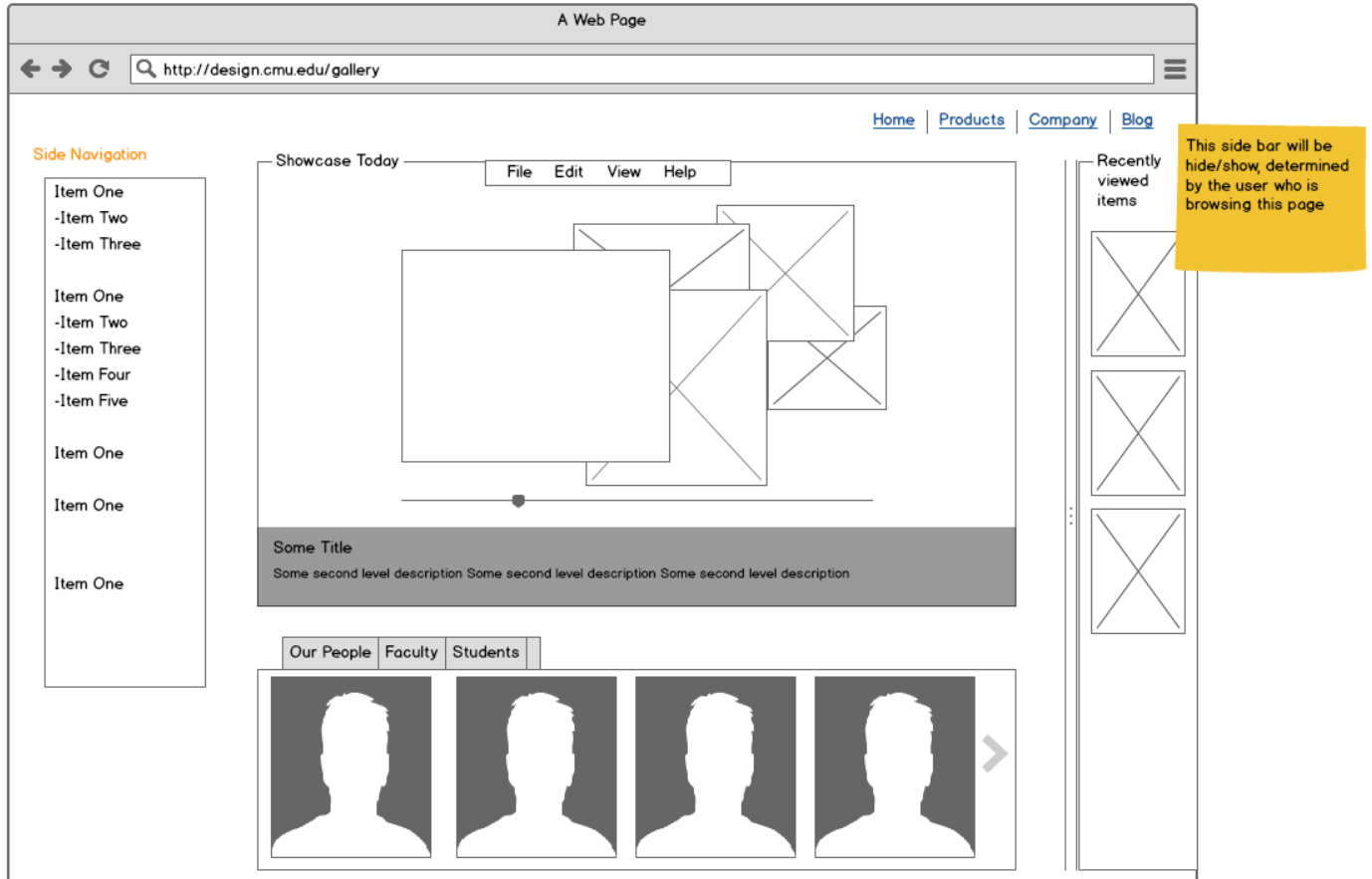
Wireframing for the Entire System and… Polish!
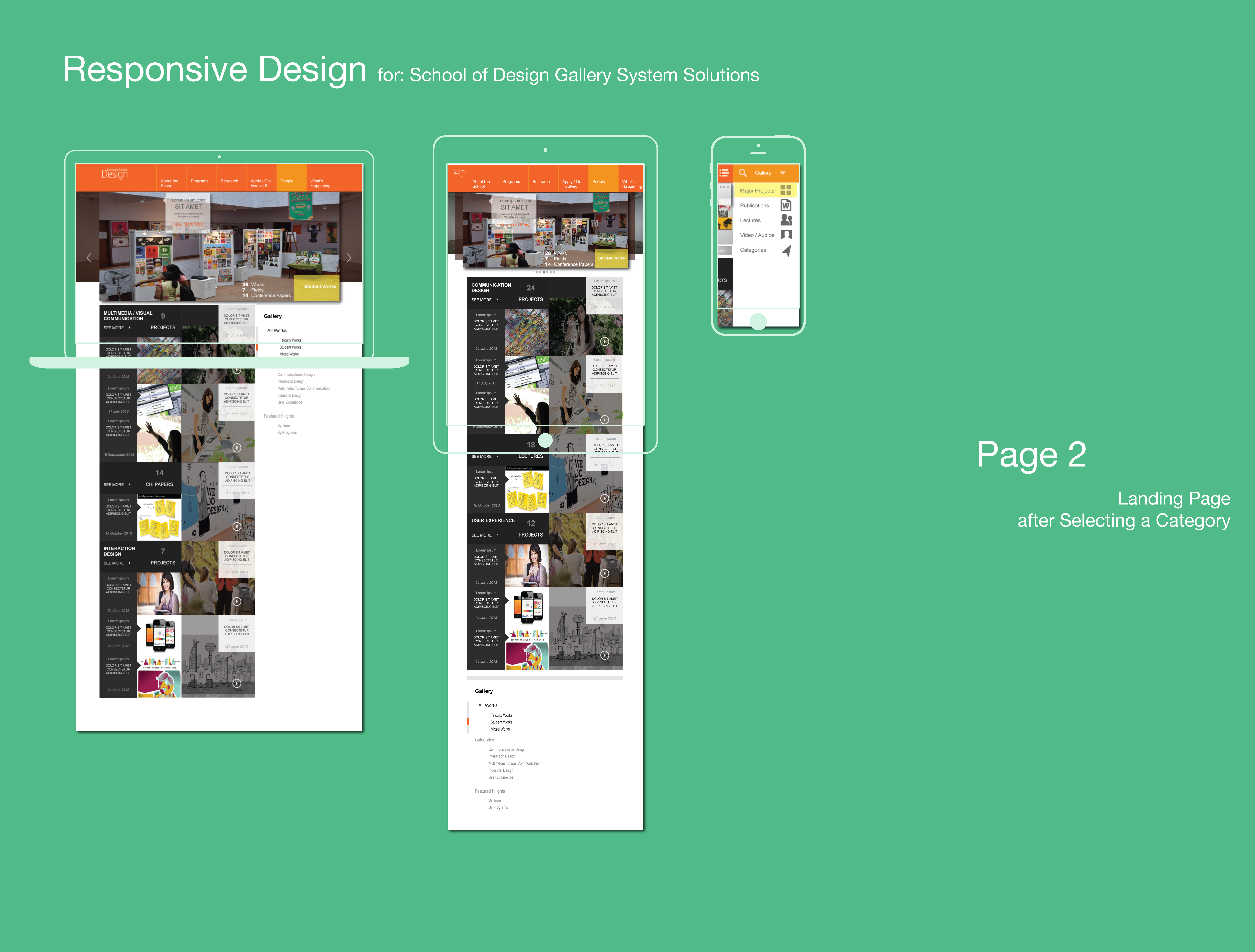
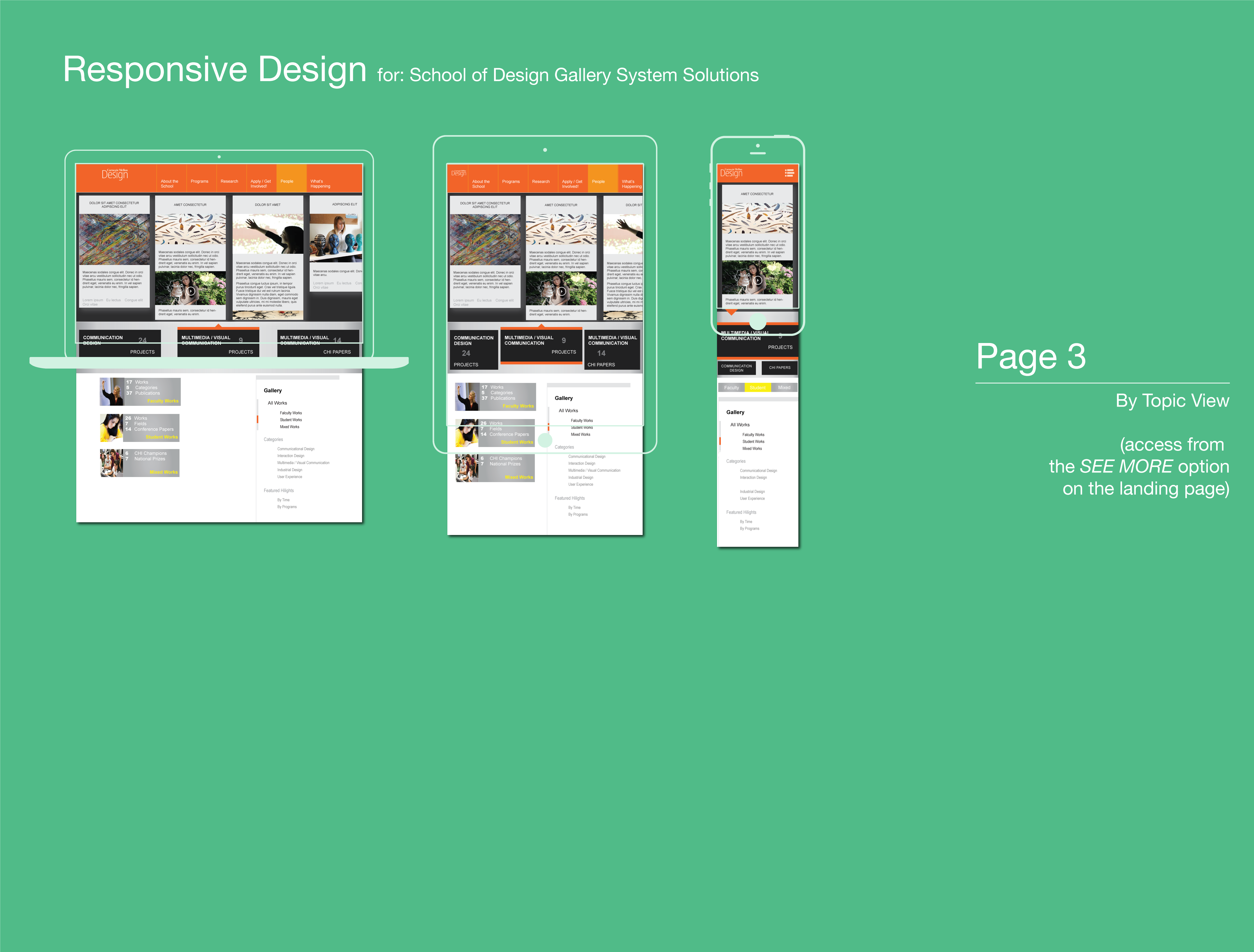
Taking “mobile first” to start the navigation design, I move forward to adapt a thoughtful but still simply elegant system design approach more confident. The system delivers three view-points respectively: desktop, mobile, and tablet.
Design Rationale
To finish a project like this is refreshing. I recorded the rationales for making key design decisions, interactions and major system flows in the document to facilitate my thought process.
![]()
