
Care Calendar
Team Project | Website Product Design
Care Calendar
Team Project | Website Product Design
Quick Facts:
Role:
UX designer + Information architect, partial developer
Time:
Fall, 2013
Client:
Self-started business that connects non-profits and individual volunteers
[Skills]
Methods:
User interviews, Rapid prototyping, Wireframing, Interaction design, Content strategy, Visual design, Responsive web design
Business:
C-P-S Customer development & hypothesis, Lean development, Minimally awesome (viable) product analysis, Product backlog, Opportunity and momentum
Tools:
Paper sketching, Adobe Illustrator, HTML5/CSS3, JavaScript, JQuery, Ruby-On-Rails, PostgreSQL
Deliverable:
Quick Facts:
Please see previous slide
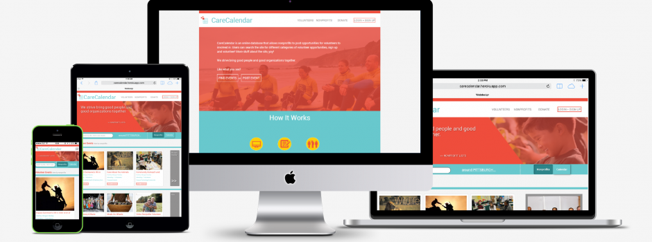
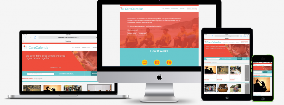
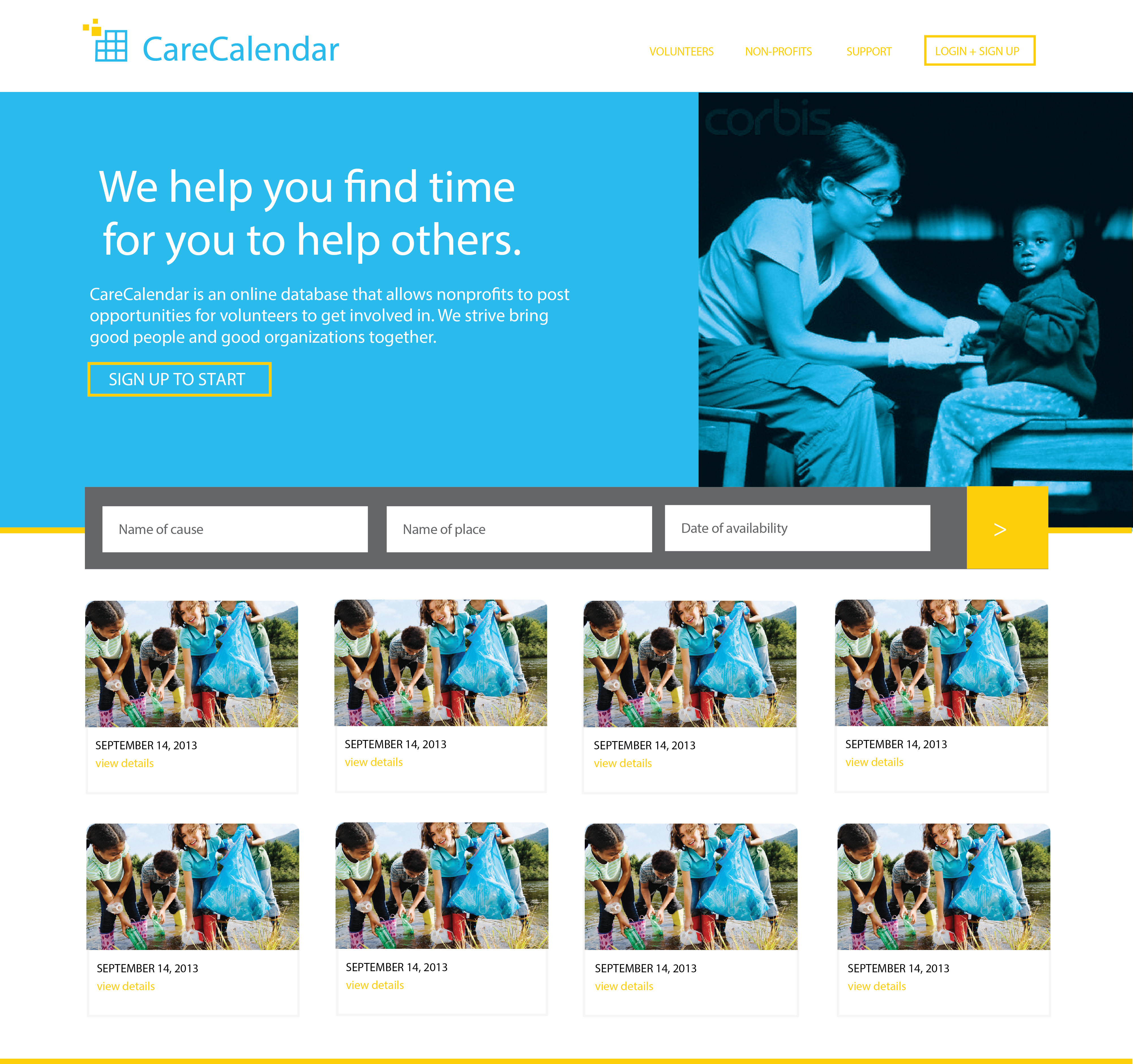
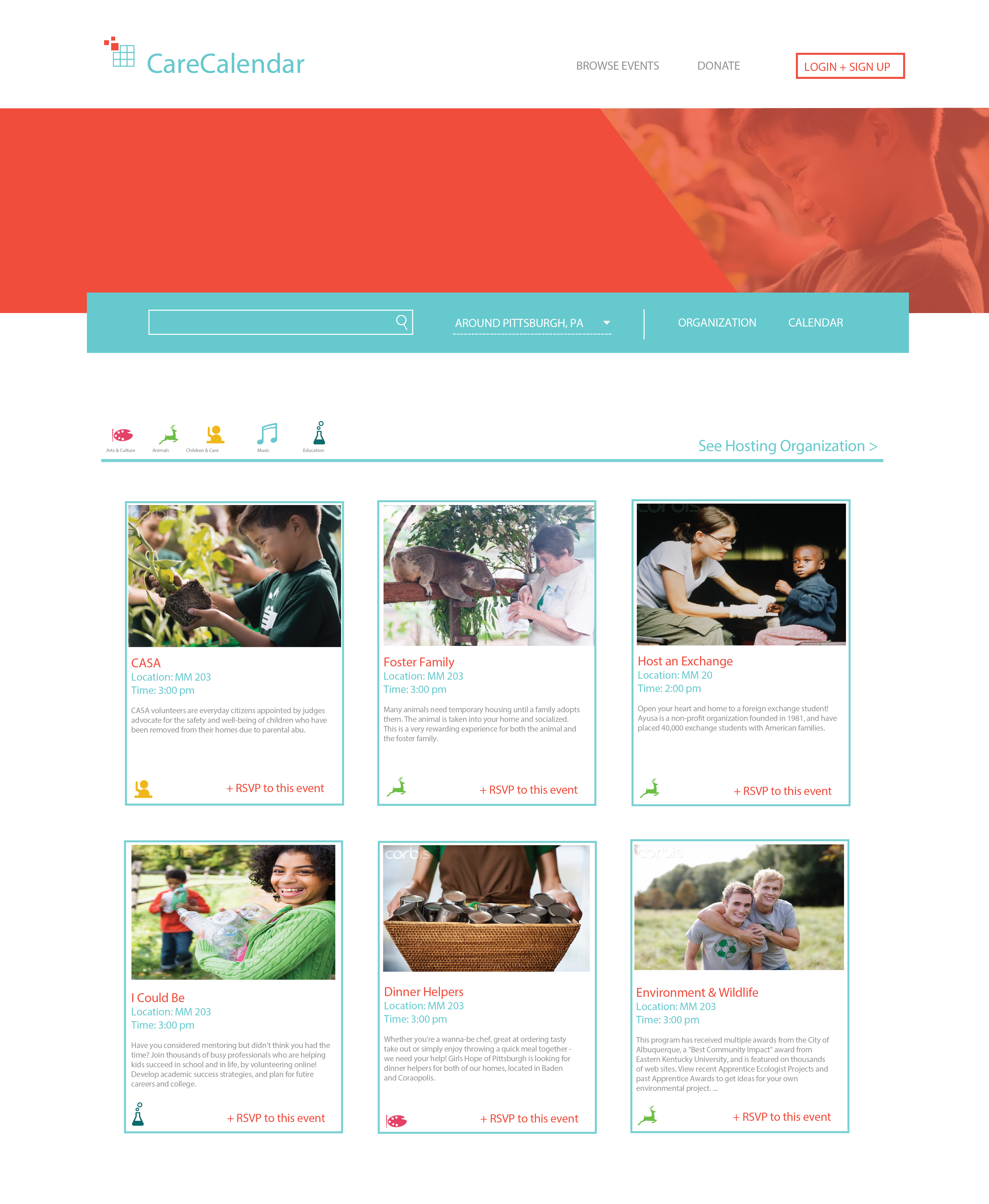
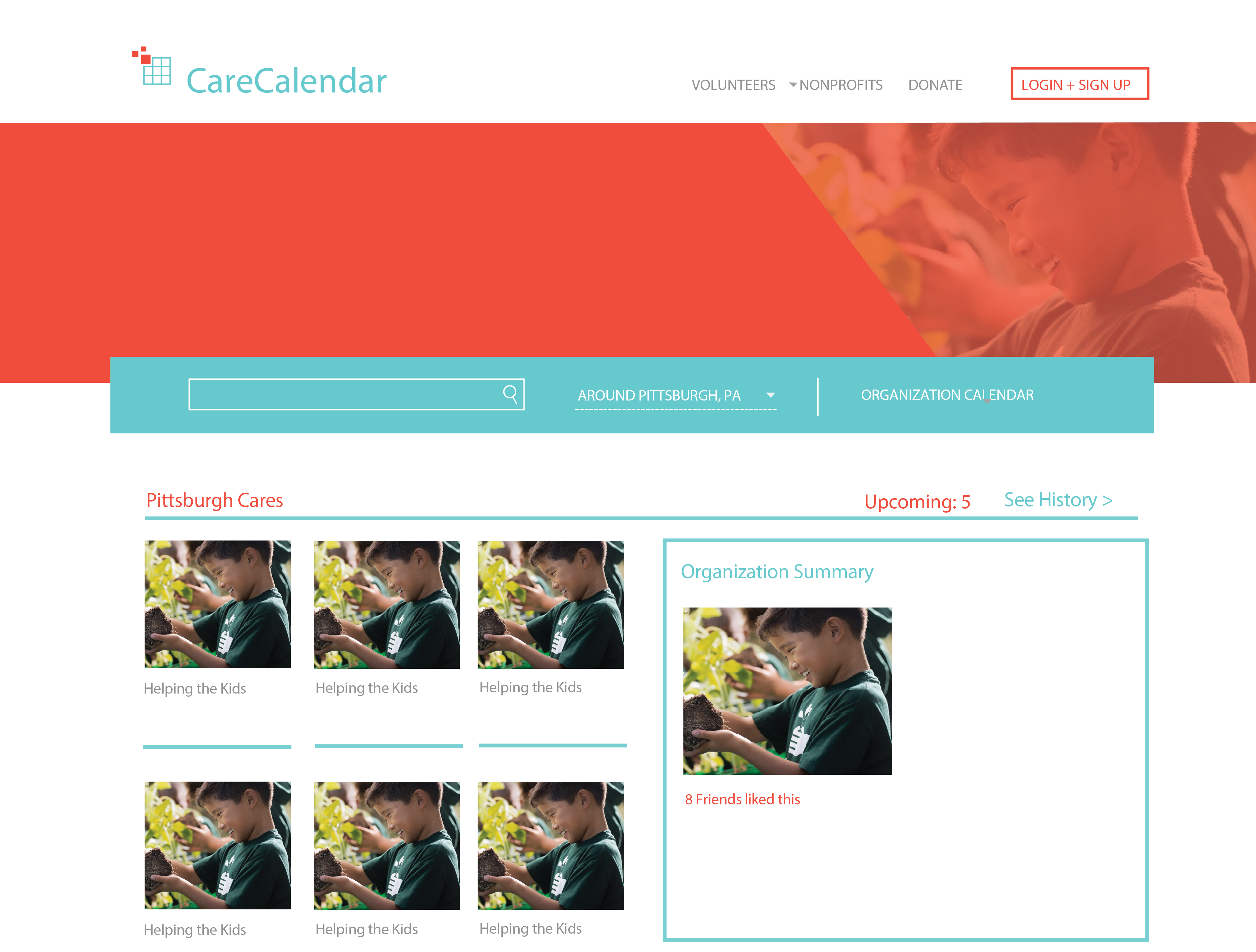
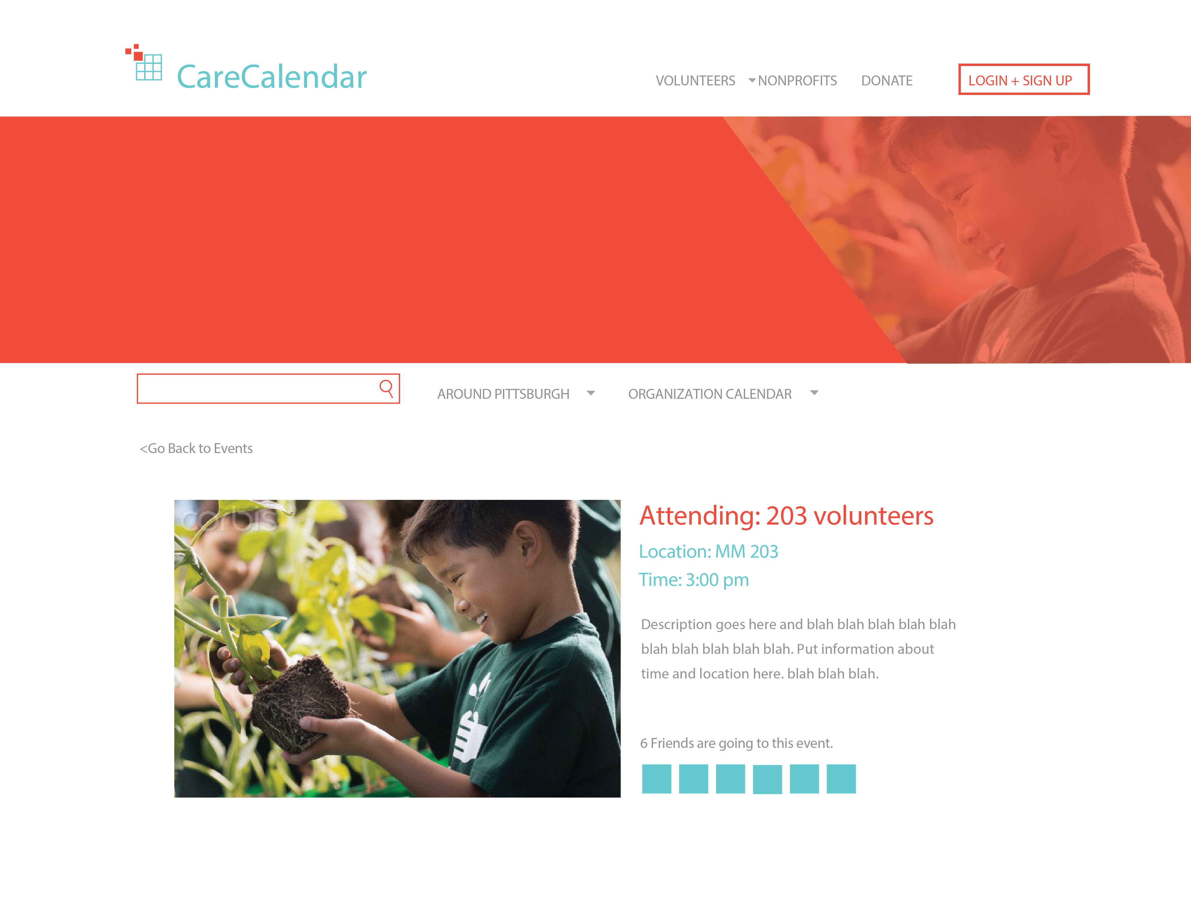
This is CareCalendar
Final product design solution:


The Problem
Nowadays, increasing attention of serving the community is becoming a hot topic for the public, especially for people with good educational background and sufficient leisure time. However, large loads of information may distract them from finding a targeted serving event to utilize their skills, let alone effectively serving for the community as what they want.
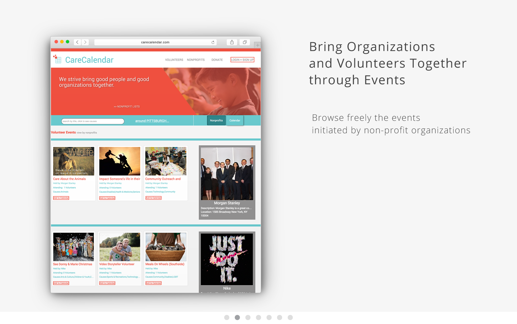
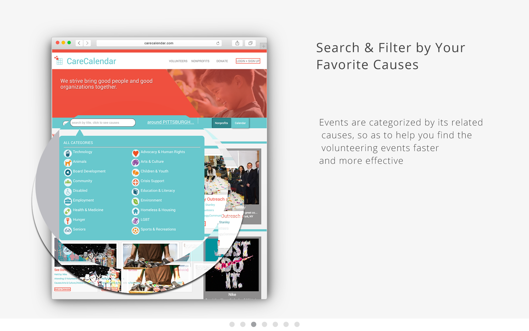
- Search volunteering events efficiently
- Display the necessary information to contact if individuals want to help
- Fit and plan ahead the volunteer events in the calendar with respect to personal schedule
Meanwhile, the non-profit organizations also desire to have people to do volunteering services with expected skills and specific areas of passion, and partnerships of volunteering are so loosely organized that finding expected volunteers can be very inefficient and costly. Therefore, serving as a bridge to link volunteers and the non-profit organizations, the company will act as a middleman to provide services online to help organizations find their expected volunteers, as well as helping people to find appropriate and meaningful volunteering activities for them to fully utilize their skills and time availability.
This initiative is believed to have the need for a web presence and my team then decide to develop a website for that cause!
User needs identification
The product we are designing for should solve a problem for an identifiable group of users.
Using the business model canvas, a visual chart with elements describing a firm’s value proposition, infrastructure, customers, and finances, I am able to lay out the business structures that our design is based on.

Under a lean development environment, C-P-S (customer-problem-solution) is also very helpful to define and test customer-related hypothesis, in order to assure the value that the product is able to provide for its user.
Customer interviews comes in at this stage. I recruited 5+ potential customers, and conducted phone interviews with them respectively. This has informed my initial process of product design to be divided into three folds:
the problem -> current situation -> proposed solution.
At this point, I am framing the problem with more service-oriented approach for the expected customers.
![]()
Planning and architecture
In charge of the information architecture design, I gathered content for the site, and drafted business plans for building the “Minimally Awesome (Viable) Product” as a best-scaled entrepreneur idea.
Use case and database design are performed in this stage in order to scale out the viability of our product.
To plan the architecture, we also created comprehensive sitemap and wireframes for all major page types.
![]()
Product backlog for scrum/lean development environment – propose from a more specific approach to make the product viable to implement
![]()
How we’d size of opportunity and generate momentum for the product/service, in order to get effective influence and satisfy market needs?
![]()
Design
Our design process is somewhat in parallel with the later architecture planning phase. For the sake of presenting, below are processes regarding design that we have gone through.
Sketching & ideation

We started off by doing some research – then we started playing around with the layout and navigation. We wanted our website to convey simplicity and friendliness. In the beginning, we tried cramming too much content so we took a step back and tried to take on the approach of the users’ perspective – how a user would navigate and what would make for the simplest and easiest way for users to sign up and volunteer.
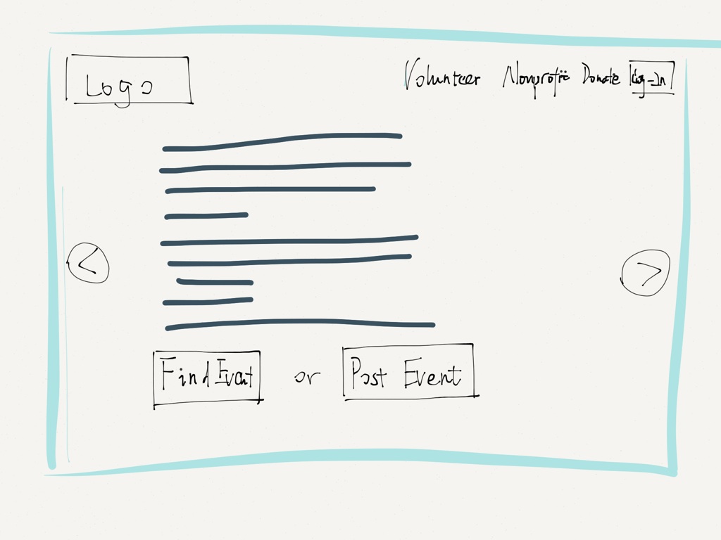
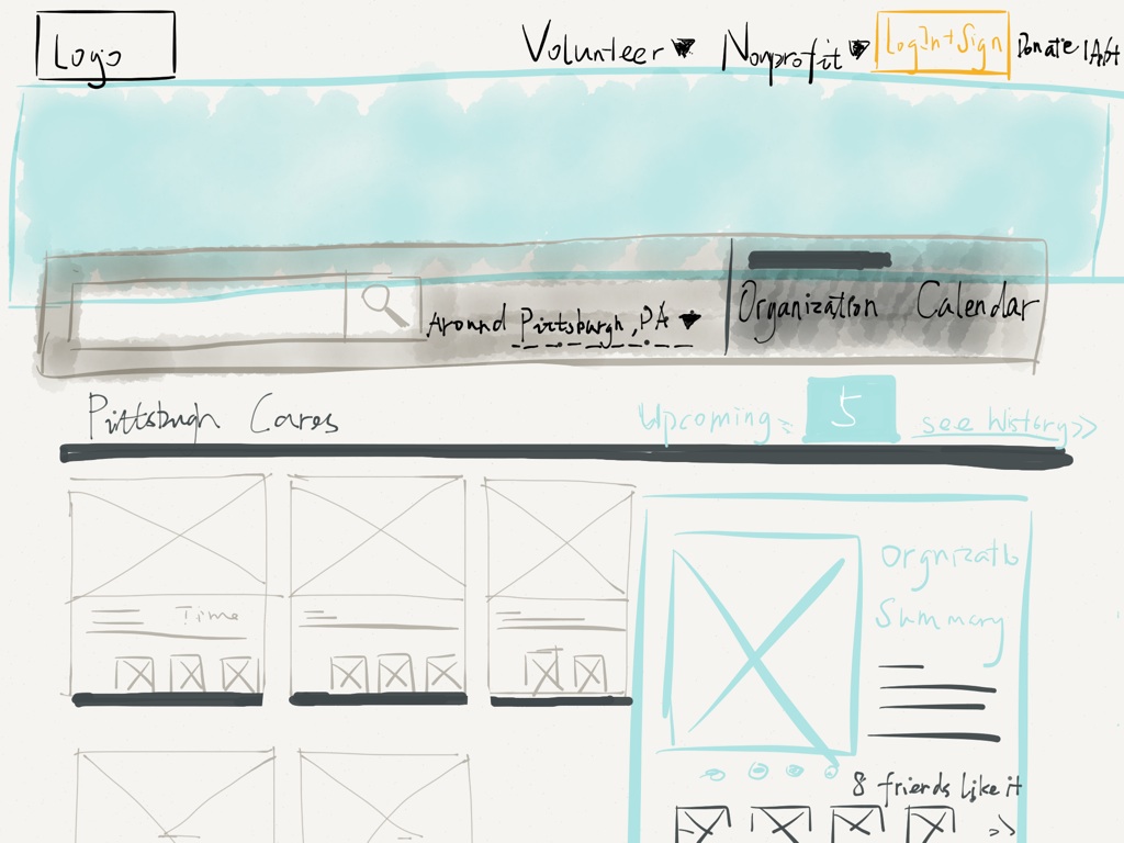
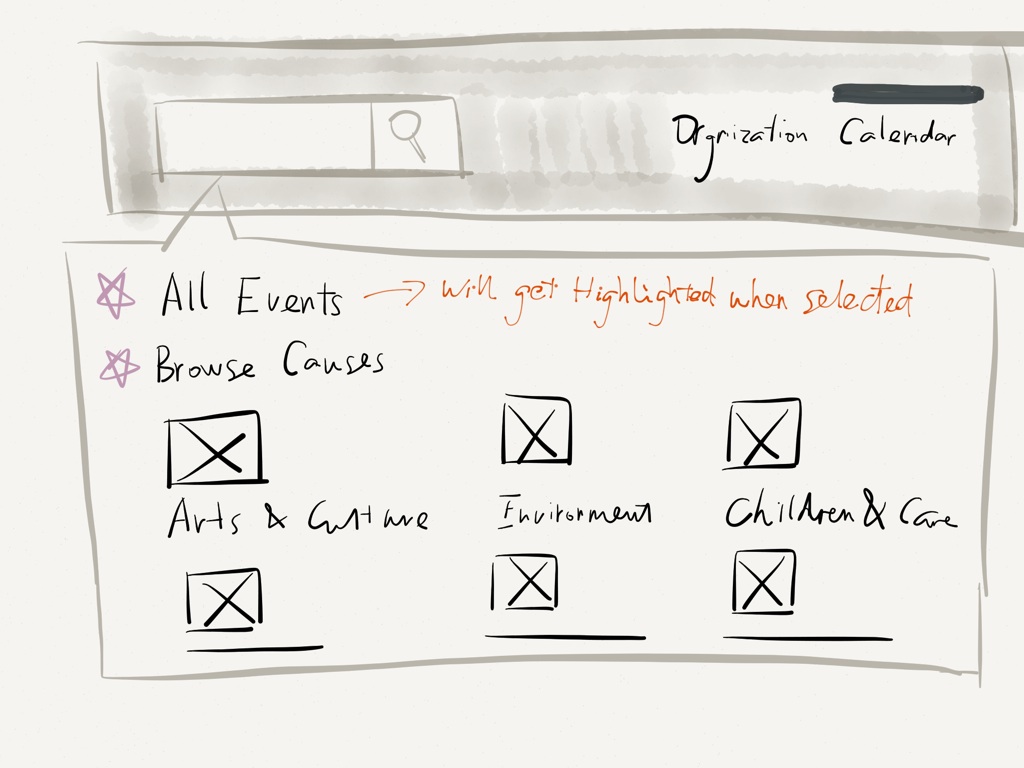
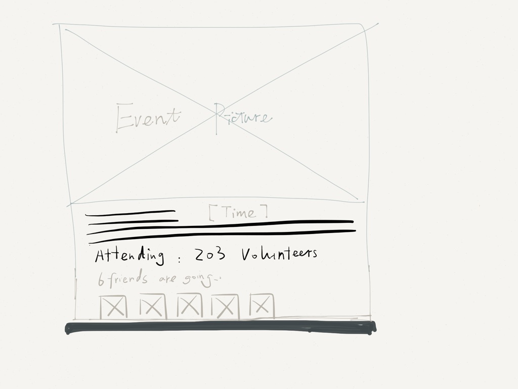
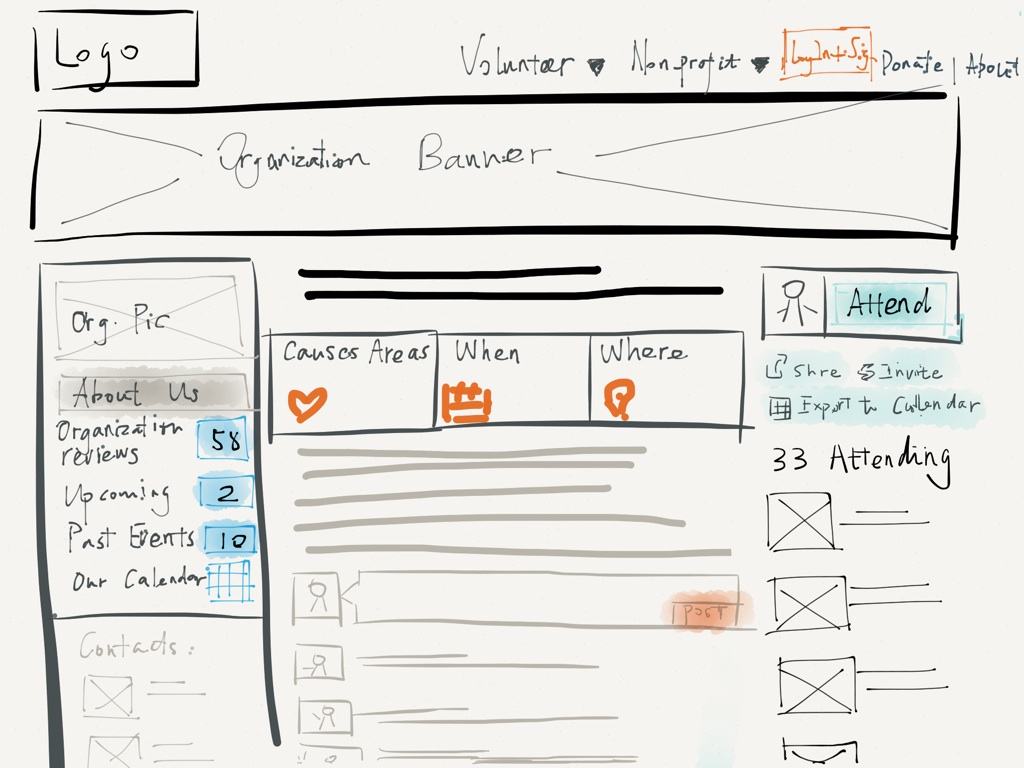
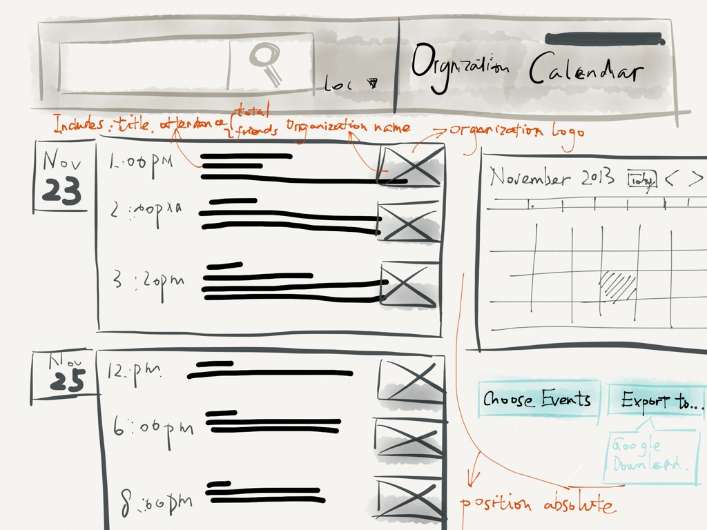
Developing low-fidelity mockups and wireframes
To make the experience of using our site simple & elegant, I started the wireframe from lo-fi sketchs, and annotated interactions and page flows on the sketch whenever neccessary. Complete set of wireframe sketchs (14 pages, PDF)
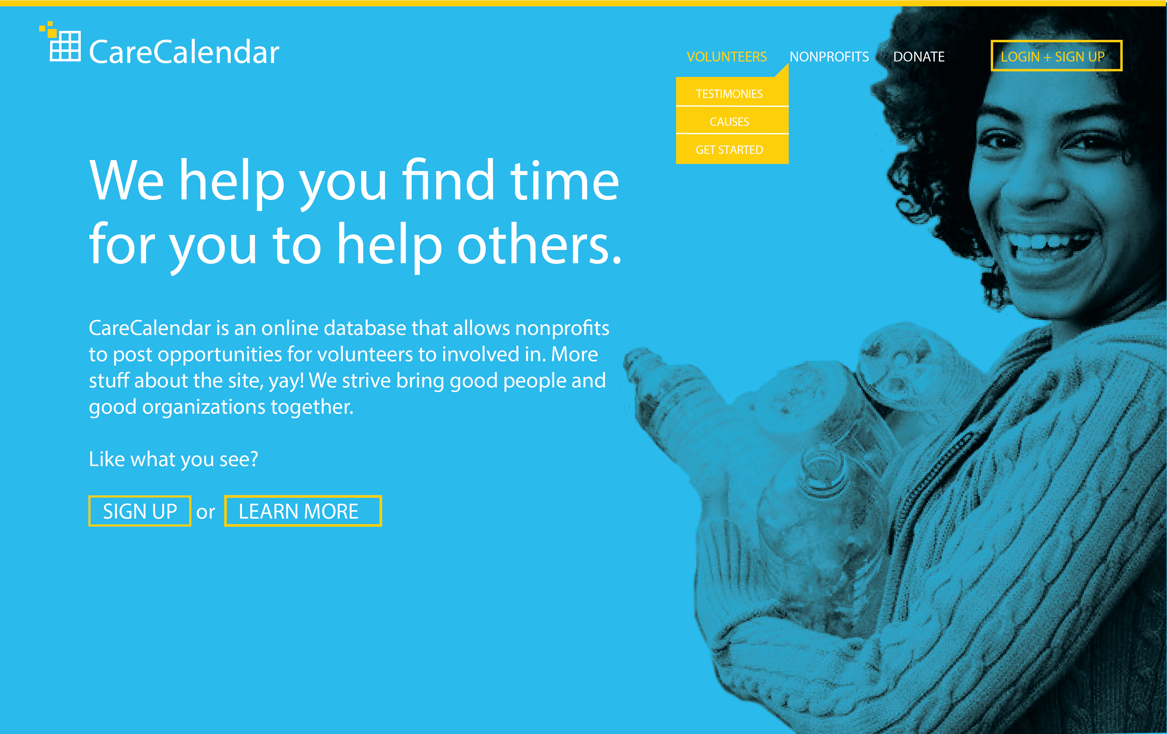
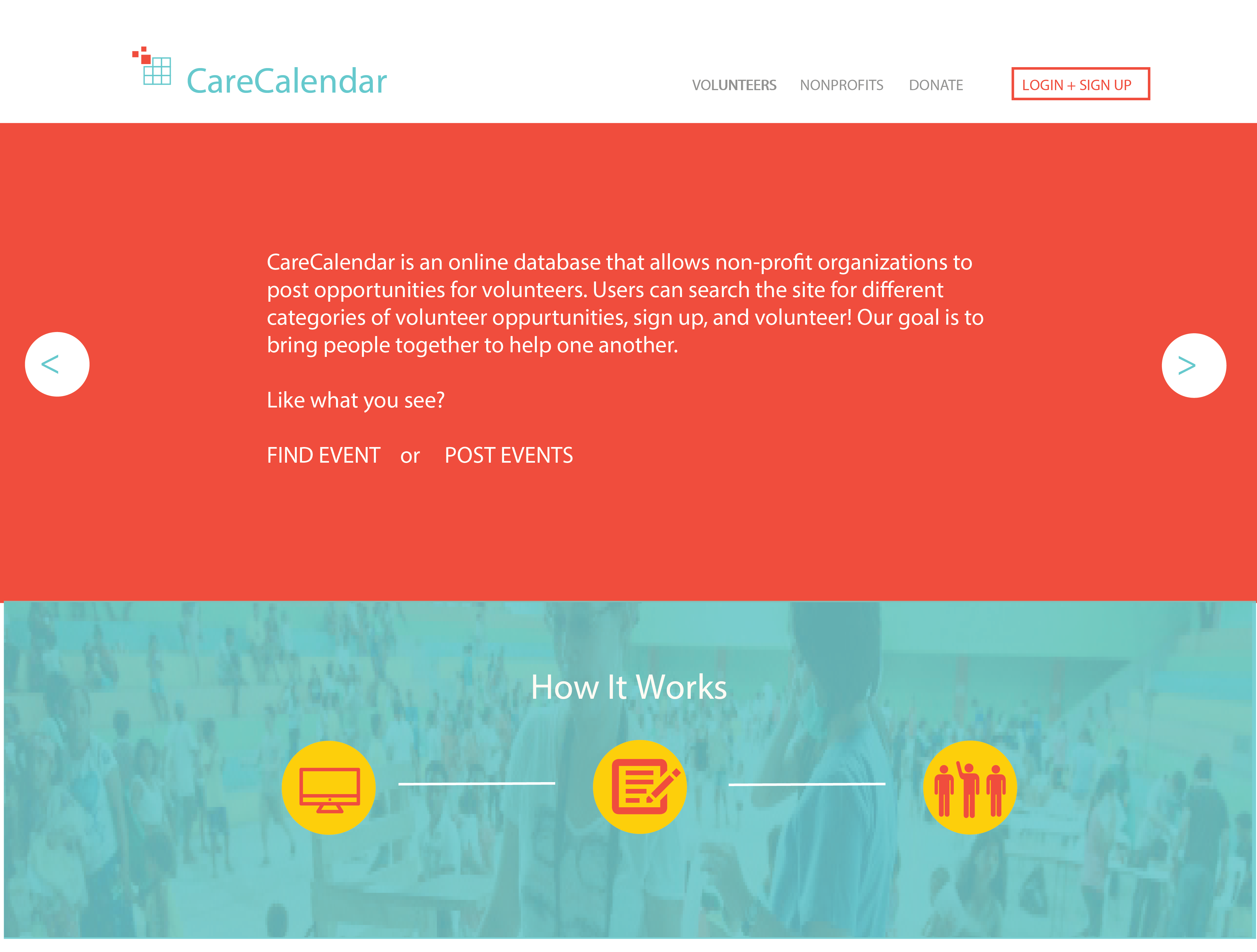
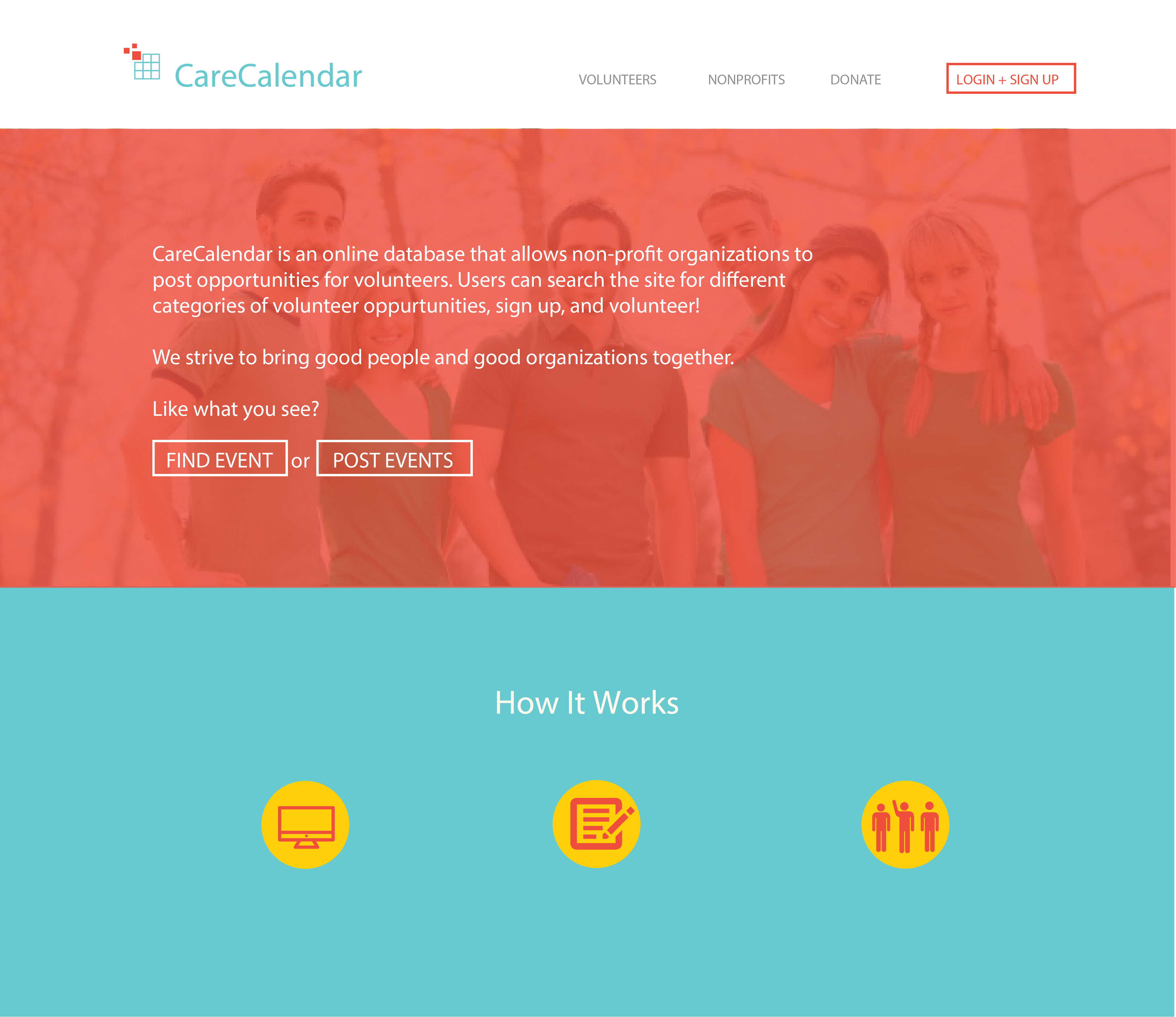
Visual design
I partnered the visual design process and made a major decision of the final visual palette direction, with respect to brand our website in a more enthusiastic impression and warm-hearted feeling, in order to bring in more enjoyment , less contrast (which may trigger some level of tensions), but still bright and delighting expereince for the user, while encouraging empathy from our targeted audience – the community volunteers.
Enforcing the visual language of our website, I also designed icons and several pages in the final version of mock-ups using Adobe Illustrator. Below are some of the visual design evolving versions along the process for some major page types: Visuals in dropbox (14 items, PNG)
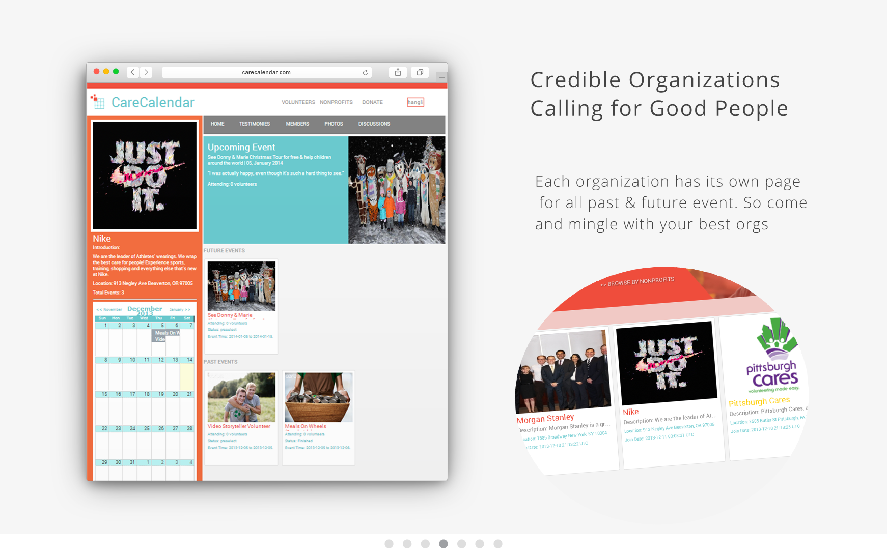
Home pages:
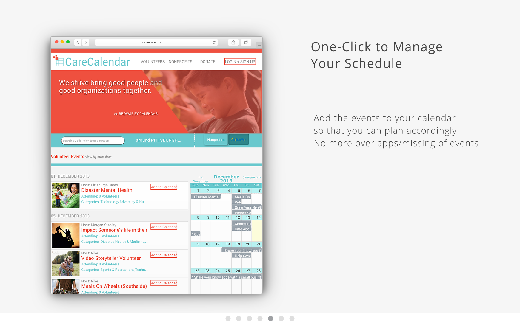
Events browsing pages:
Event details pages:

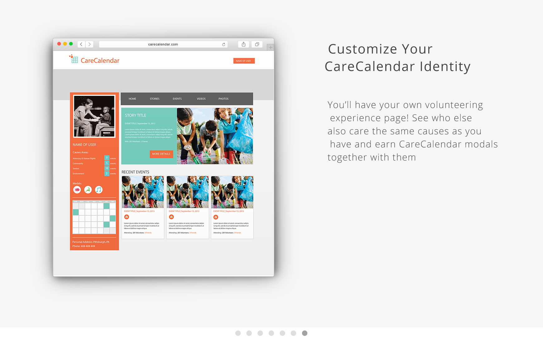
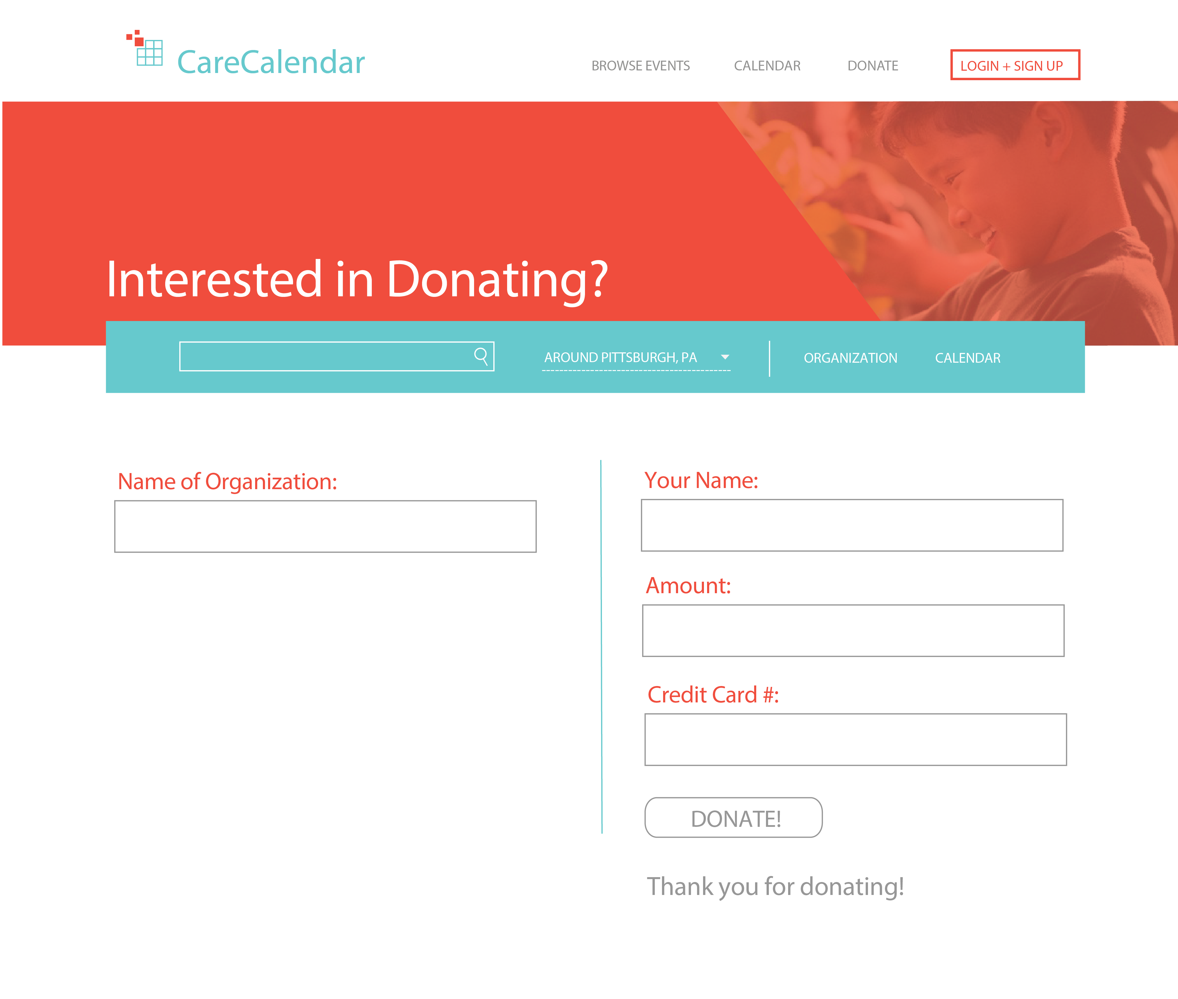
User profile pages & miscs (icons, donating form page):

Responsive design
Mobile First or More Adaptive?
We applied responsive design practice into our product, with “Mobile First” – the special design emphasis to adapt mobile products first. But for the sake of html5/css3 capabilities, we want it to be applicable from the web point of view, so we designed the web elements for desktop first so that it is easy to develop with careful front-end engineering process. However, “Mobile First” has embed throughout the whole design process, and our website definitely benefited from the mobile sense with a more intuitive & clear navigational structure, which directly adds value to user’s core needs with just right level of content presence to the audience.

The responsive site has covered more than three design scenarios (phone, tablet, computer).
To play around our final product, please visit: carecalendar.herokuapp.com
