
Mobile Wedding Registry, and More
Internship Project | UX & Interaction Design
Mobile Wedding Registry, and More
Internship Project | UX & Interaction Design
Quick Facts:
Role:
UX designer
Time:
Summer, 2014
Client:
Amazon Retail Hardlines Group, Wedding Registry
[Skills]
Methods:
Interaction design, Responsive design, Use case, Ideation, Wireframing, Visual design, Iteration, Parallel prototyping, Product/Service design, Scrum, JIRA
Tools:
Pen & Paper, Axure RP, Illustrator, Photoshop
Deliverable:
Hi-fi mockups, Interactive prototype, Redline specs
Quick Facts:
Please see previous slide
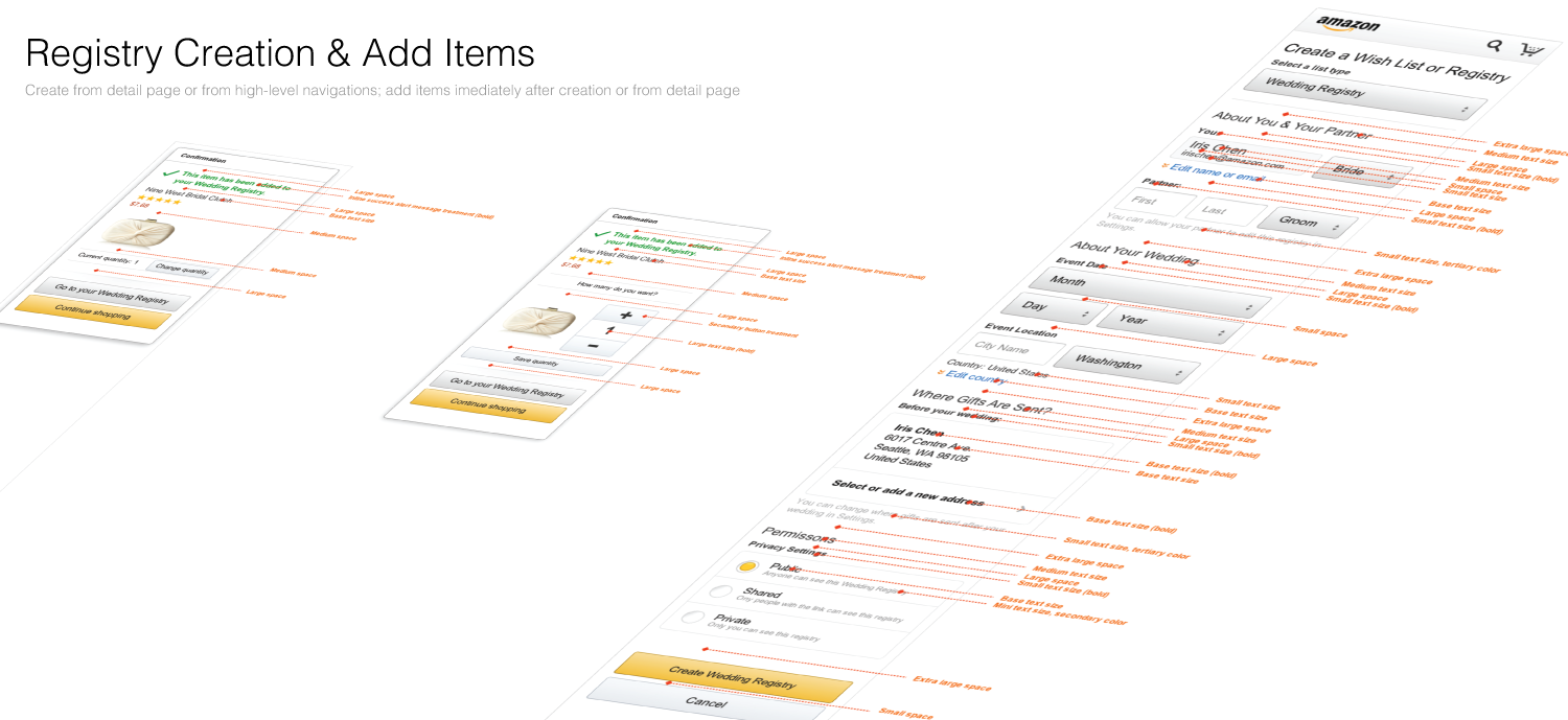
Goal: How to design a good parity product on mobile for an existing web product? This is one of the design challenges I took ownership on during my full-time internship at Amazon. Wedding Registry is an existing gifting product for engaged couples to use on Amazon’s online shopping site, and the team wants to transition the product usage into the mobile space. The new Mobile Wedding Registry needs to provide engaged couples the ability to create, add, manage, and add items they wish to have to their wedding registry on a mobile device.
Due to NDA, some details of my work are hidden, as the mobile feature is part of my UXD internship work that got released soon after I concluded my internship with Amazon.com.
To start with:
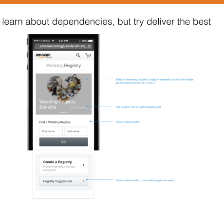
Very low legibility for the product landing experience

Very low legibility for the experience of exploring "most registered for products " on mobile
Not able to manage wedding registry settings or personal preferences on mobile

Not able to add items into wedding registry on mobile
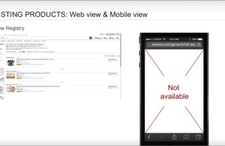
Not able to view registry and customize registry related actions on mobile
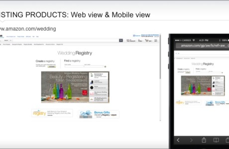
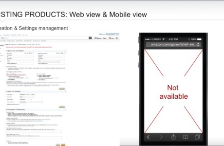
Before kicking off the design for mobile, wedding registry can only support a non-adaptive view on mobile devices. All elements are just a “shrunk size” of the web version on the mobile screen, or simply just not available to access.
Design Process
- Define product design tenets in the early phase to accommodate both specific business values and design needs. Help develop use cases based on existing Wedding Registry on amazon.com site, evaluate & re-evaluate the scope for mobile minimum viable product, as well as upcoming releases up to V2.0
- Research on competitors such as Walmart, Zola, eBay and parent/parallel products such as Wishlist and Baby Registry on amazon.com site, to find out design conventions and patterns
- Ideate on design options; sketch to communicate with PMs and Development Managers about the approach
- Critique both internally with the team of designers and with stakeholders, as well as bar raisers to gather feedback and improve the design
- Wireframe & Prototype all elements in Axure and ensured smooth communication with the combination of annotations, mindmaps, and interactive mockups
- Present & Defend designs and key milestone deliverables in all product-related meetings and discussed deeply with stakeholders (PM, Development Manager, Developers, and stakeholders across teams such as the wish list team, the baby registry team, the customer service team, AUI, etc) to address design proposals and simplification of processes; made effective suggestions to align customer benefits and ensured improvements of mobile experience
- Iterate by socializing the design with teams and all stakeholders to resolve dependencies and meet specific needs
- Deliver visual design specs and tailor UX execution to meet both business requirements & development timelines
- Execute the design with the engineering team, track and audit the agile development using Scrum & JIRA, and support developers if they have any questions
- Now implemented and launched on mobile web
Work Samples
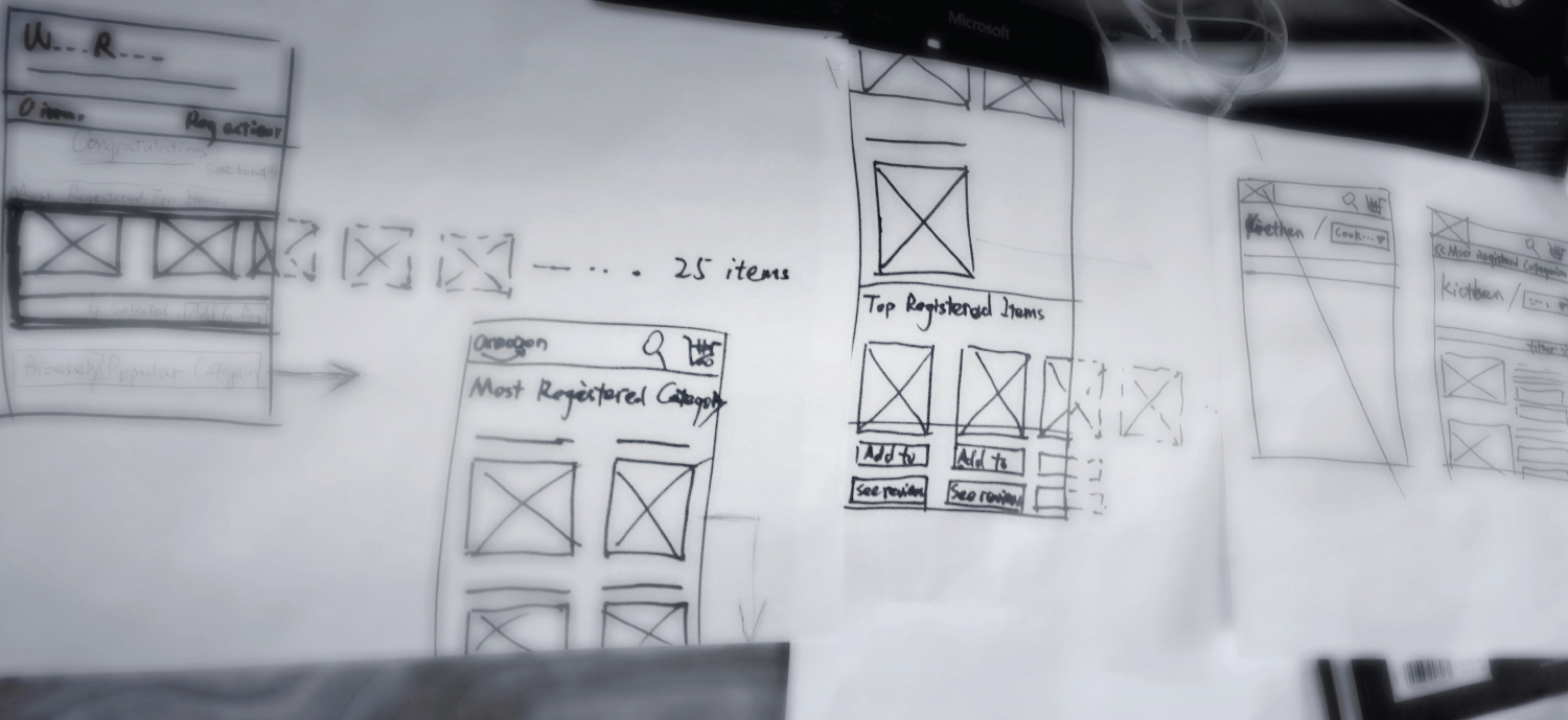
Flow charts/mindmaps

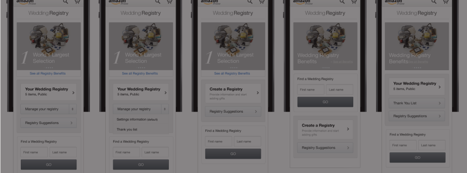
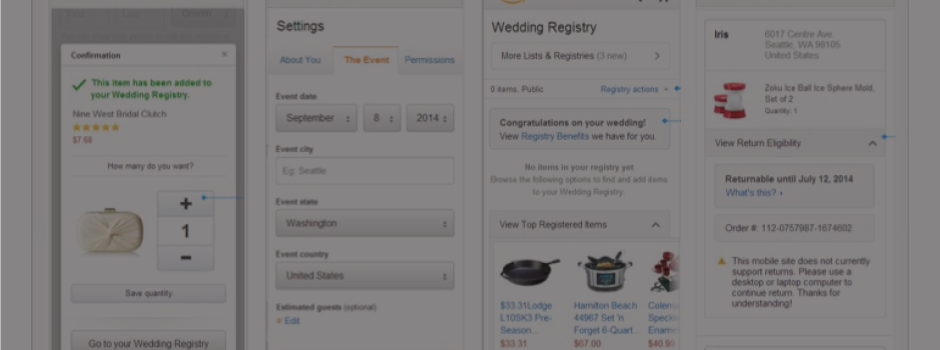
Wireframes


Some parts are blurred intentionally, as they included features not yet released.

Some parts are blurred intentionally, as they included features not yet released.

Check all wireframes in higher resolution (pdf) here
I also converted the lo-fi wireframes into hi-fi interactive mock-ups in Axure. (Please understand that I cannot share Axure prototypes due to NDA, as some V2.0 features on them are not yet released)
Iterations
I completed 14 rounds of iterations on the 40+ wireframes, for both the M.V.P & follow up releases.

Why so many iterations?
In an agile development process, I found it very helpful to act first, get hands dirty, get people’s feedback, get communications on going, and learn by doing it – in the process, as a designer I am like an “educational coach”, who thinks things through and able to help the team overcome uncertainties. Also during iteration, I become more comprehensive to even cover every tiny edge cases.
Parallel prototyping
In this project I had a chance to help my team keep from fixating on a design direction too early towards a less superior result, by parallel prototyping, where I had the team considered a range of potential design ideas simultaneously before selecting and refining one specific design approach.
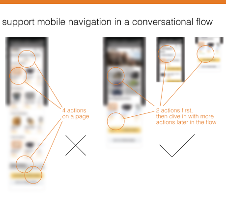
When considering a suggested way to help users add items to their registry, especially when the registry has few items, various ideas appeared regarding how to showcase hierarchical content, while still encouraging users to browse featured contents and take a quick action.
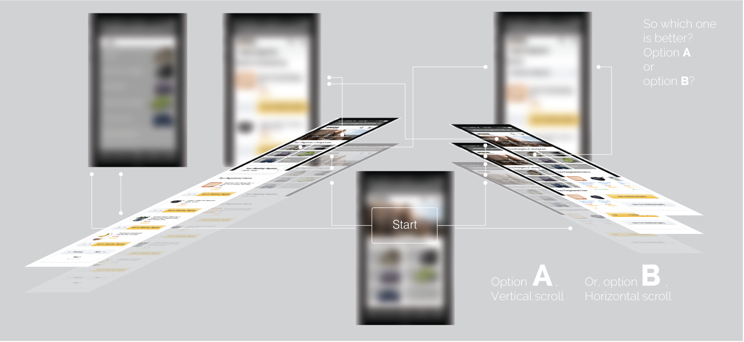
I quickly and independently created a range of low-fidelity prototypes, mocked up in an interactive way, and then submitted designs to testing by end users and heuristic evaluation by experts. I observed during the internal critiques, my parallel prototypes helped designers to thoughtfully reflect and consider how people react to individual elements of the design, and which accomplish the intended goals of the project.
This way, I shifted focus from the designer onto the design, as well as promoting team collaboration and building rapport.
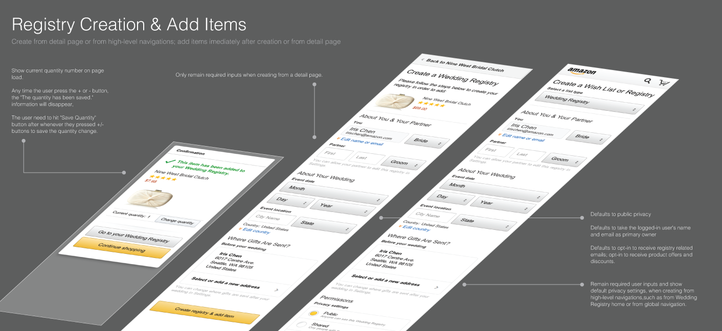
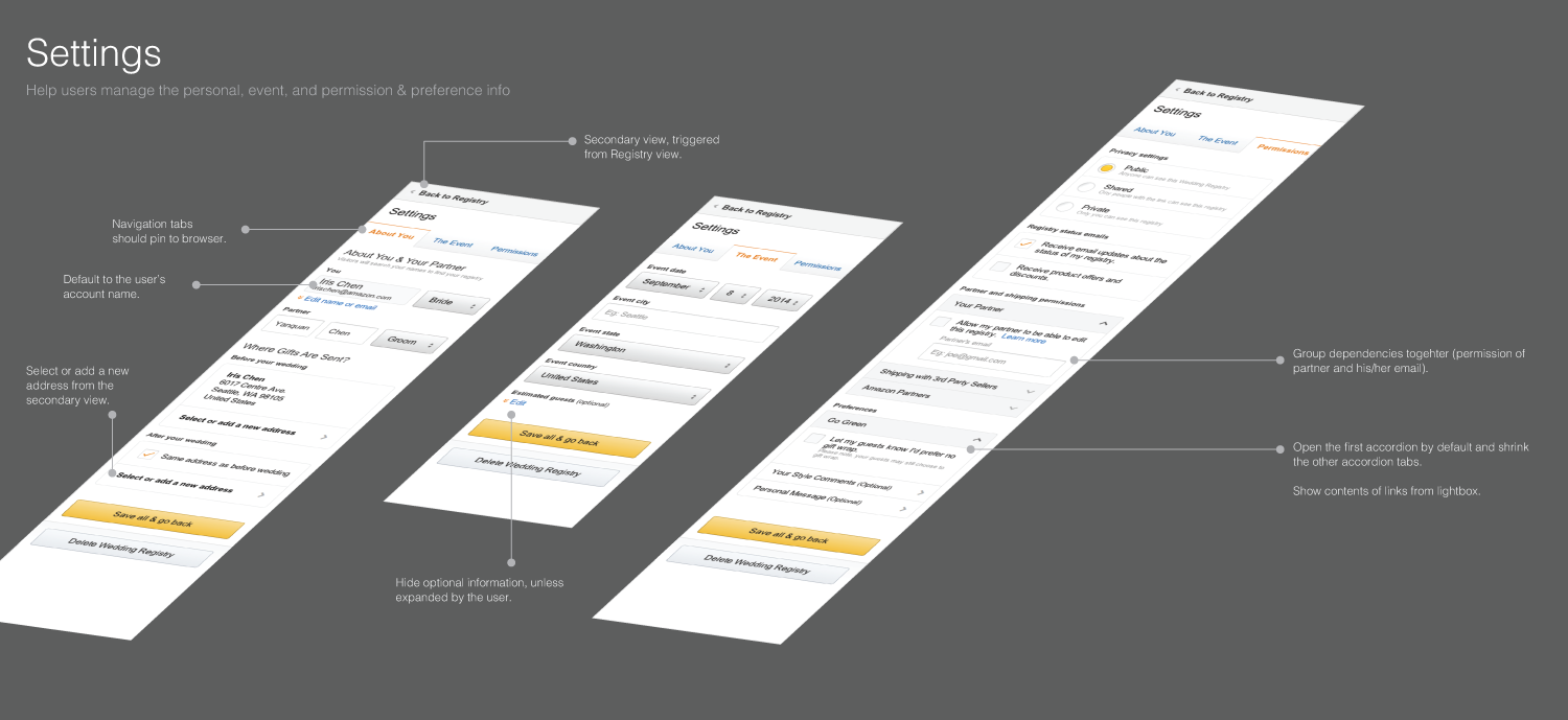
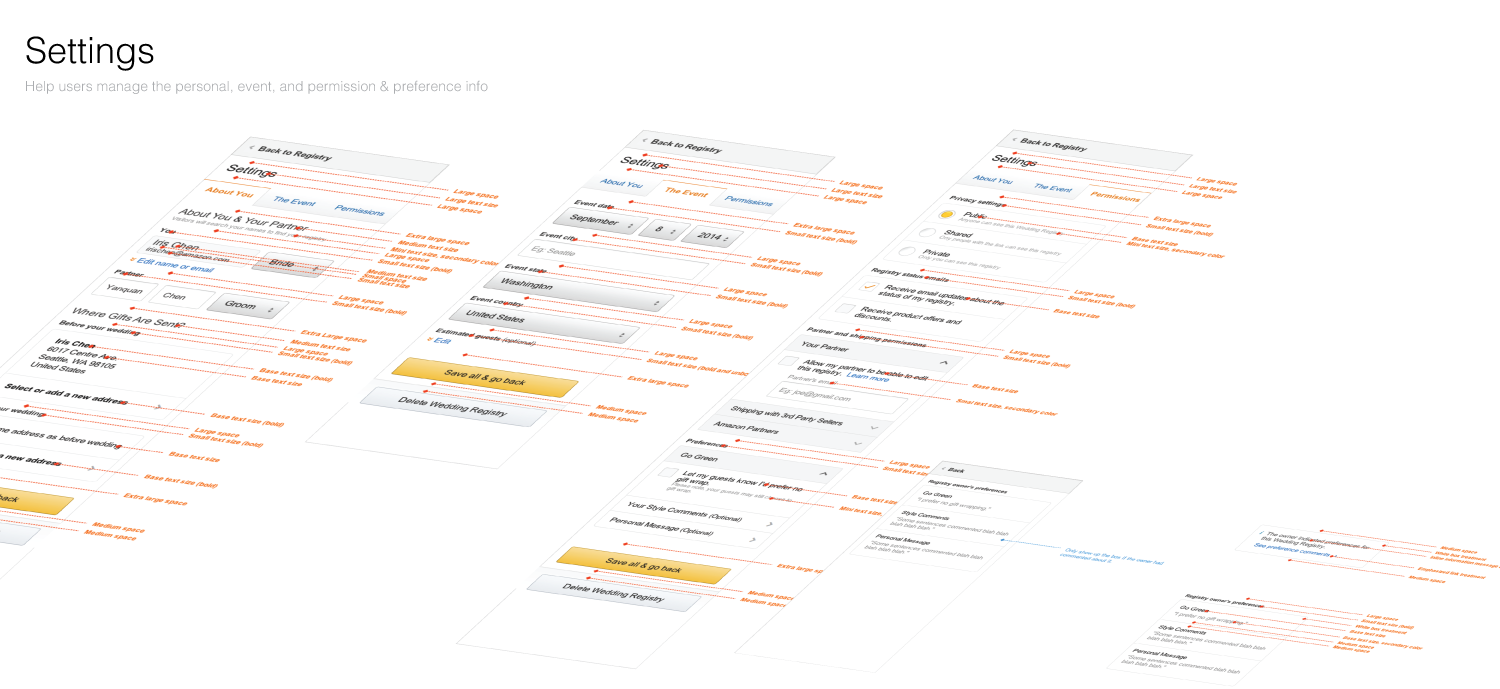
Visual specs
To hand off to the developers, I also created redlined design specs to clarify both content logics and visual languages. Below are sample work I did for the minimum viable product (M.V.P).

